Fermion Imaging
Solutions
Brief
Brand identity system for a science instrumentation company — built from scratch for a graphic design course and continued into an independent study. The brand needed to feel established and technically credible to a scientific audience without falling into generic lab-coat futurism.
Logo concept
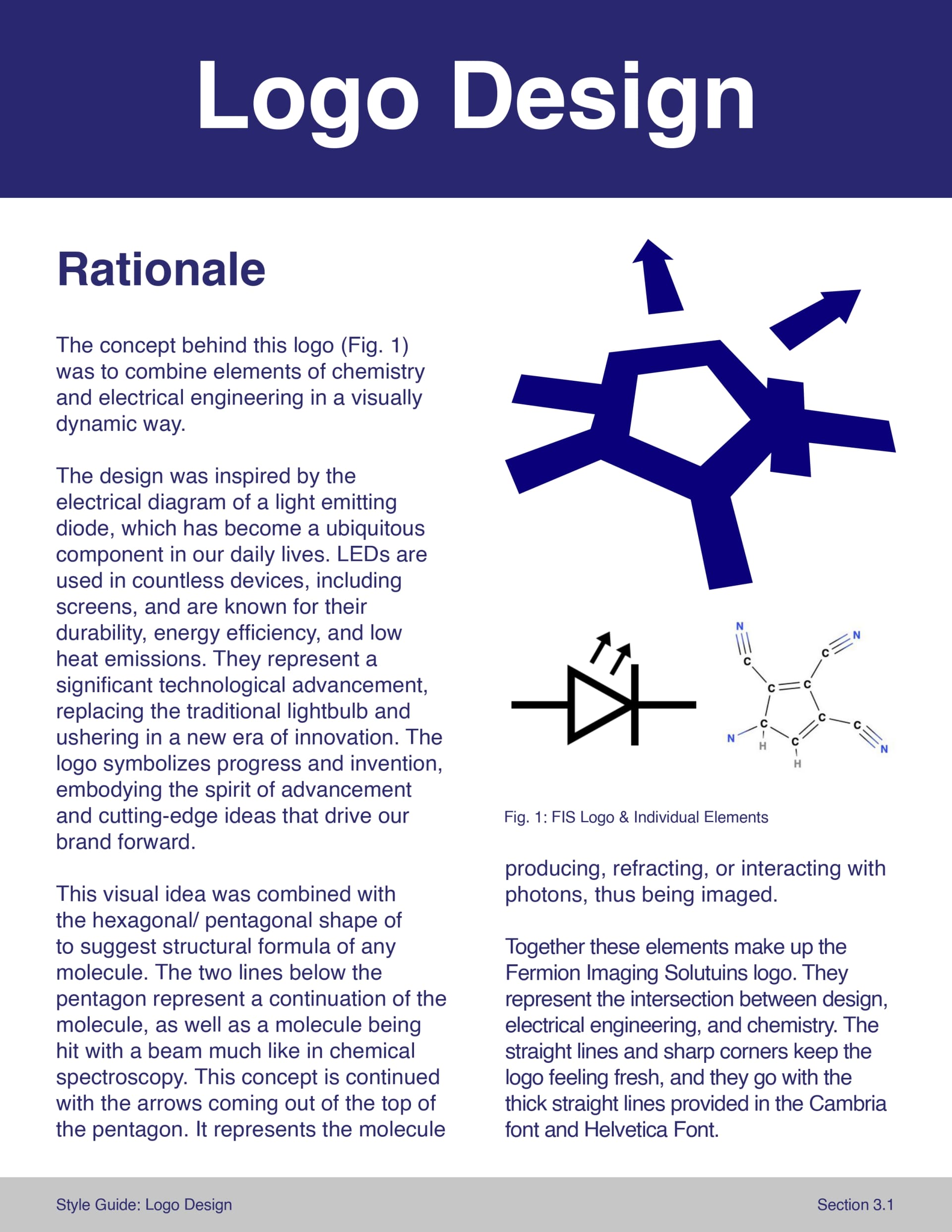
The logomark combines two reference systems: the electrical circuit diagram of a light emitting diode, and the structural formula of a molecule. The central pentagon suggests molecular geometry. The lines extending below it represent both a molecular continuation and a beam striking the molecule — as in chemical spectroscopy. The arrows at the top represent the molecule producing, refracting, or interacting with photons: the thing being imaged. Together the elements describe the act of imaging at a molecular level, which is what the company does.
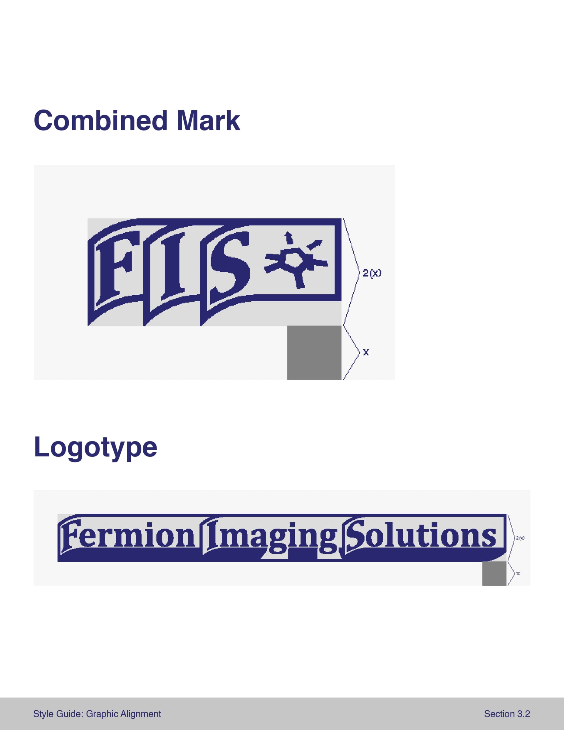
The logotype uses Cambria with the capital letter of each word arched slightly to suggest dimensionality, paired with a close thick stroke. The letter G breaks through the bottom of that stroke — a deliberate reference to the double slit experiment, in which two small cuts demonstrated that light behaves as both particle and wave simultaneously. A sliver of light comes through rather than an intersection.
Iteration
The initial direction used pixelated forms — scientific software and graphic design of the 1990s was a direct reference, the era when much of the foundational imaging technology was developed. The instructor didn't see it. The critique pushed toward something cleaner and more modern. I kept the underlying geometry and sharpened the execution: same reference points, straight edges, resolved into something deployable. The constraint produced a stronger outcome. The final system is more rigorous because it had to survive a conversation.
System
Primary colors: deep navy (#2d2d6e), slate teal (#334b53), and a magenta accent (#9d2b6f). Typography: Cambria Bold for display, Helvetica Regular for body. The style guide covers logo usage rules, color specifications, and misuse examples, and was designed to be followed by anyone — clear enough that the brand survives handoff.

Application
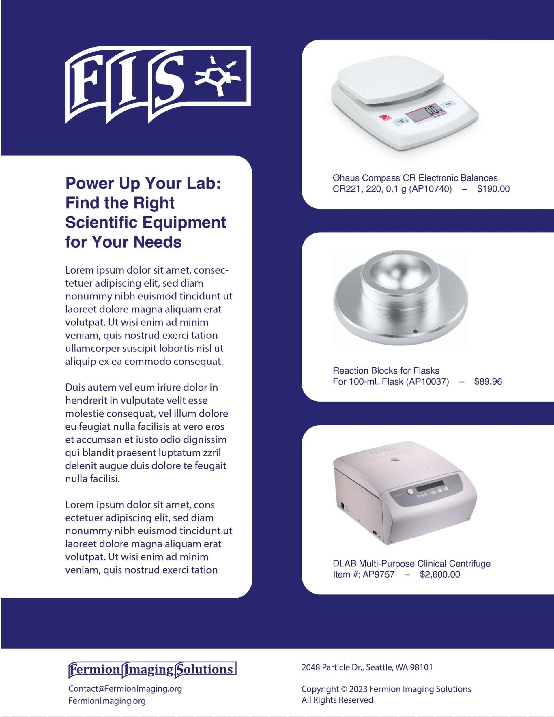
The independent study continuation developed a web presence proposal and accompanying marketing materials — a product catalog layout and an ad mockup applying the brand to real instrumentation photography. The brand holds up at both scales: a style guide rule and a finished ad.